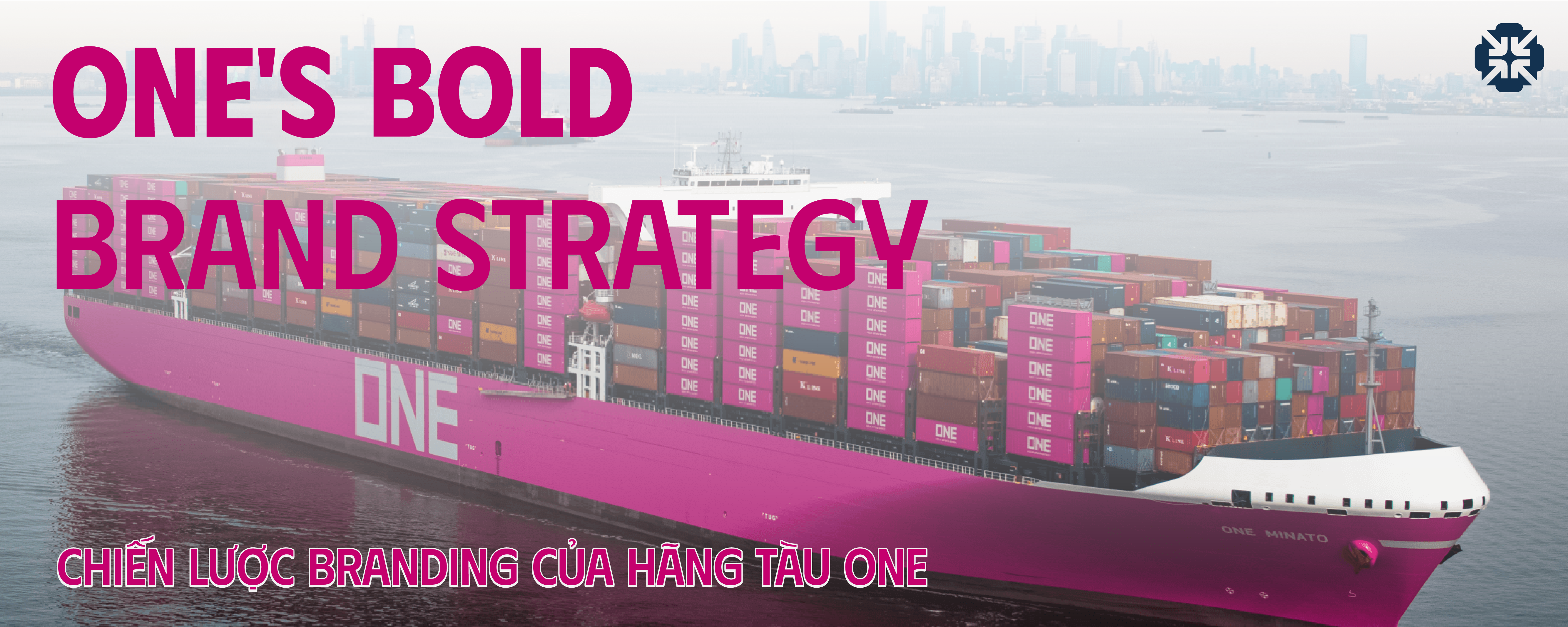
In the traditionally conservative world of maritime shipping, where container colors rarely stray from navy blue, brick red, or metallic gray, Ocean Network Express (ONE) has turned heads by painting all of its containers bright magenta. But this is more than a visual gimmick—it's a calculated branding strategy that helped ONE stand out in a crowded, highly commoditized industry.
So what makes ONE’s branding so effective? Let’s dive into this unique case study.
Who Is ONE? The Merger of Three Japanese Giants
Ocean Network Express (ONE) was established in 2017 through the consolidation of three major Japanese shipping companies: NYK Line, Mitsui O.S.K. Lines (MOL), Kawasaki Kisen Kaisha (K Line)
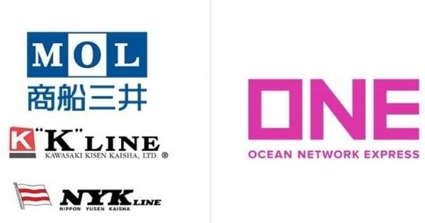
Faced with increasing competition and shrinking profit margins in the global shipping industry, the three companies chose collaboration over competition. Rather than maintaining their legacy brands, they formed ONE—a new, unified brand designed to represent both tradition and innovation.
ONE’s Branding Strategy: Standing Out Through Color
Why Magenta?
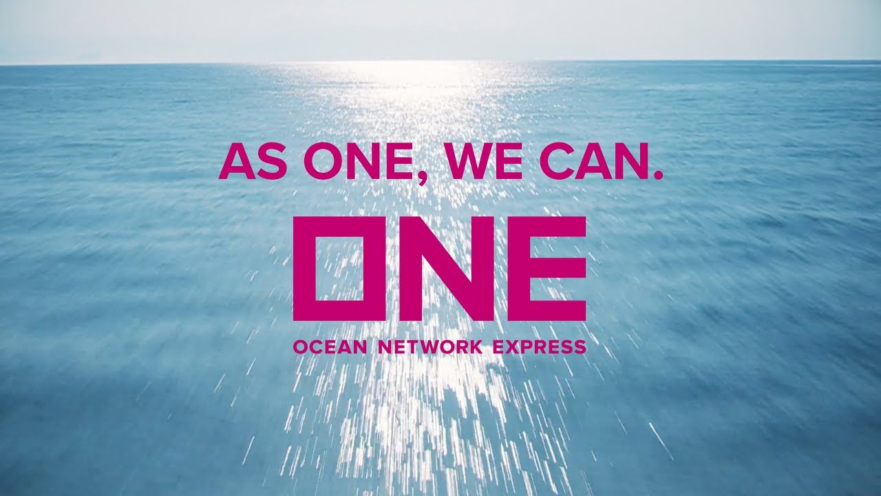
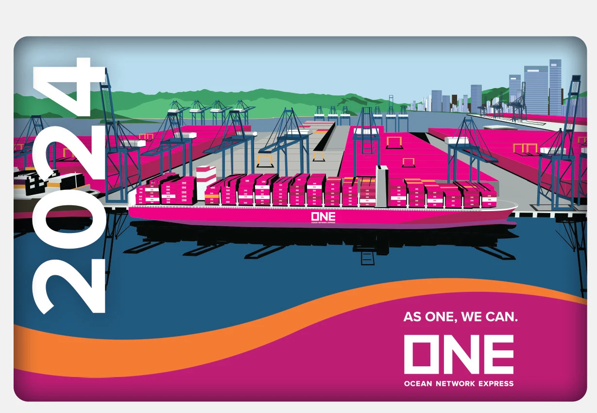
ONE’s most distinctive branding move is its decision to paint all containers magenta, a color rarely—if ever—seen in the shipping industry.
This bold color choice was strategic:
- Instant brand differentiation from other shipping lines
- Strong visual impact in ports, on roads, and across global supply chains
- Social media appeal—people started posting magenta containers simply because they stood out
- A symbol of innovation, unity, and fresh vision for the post-merger company
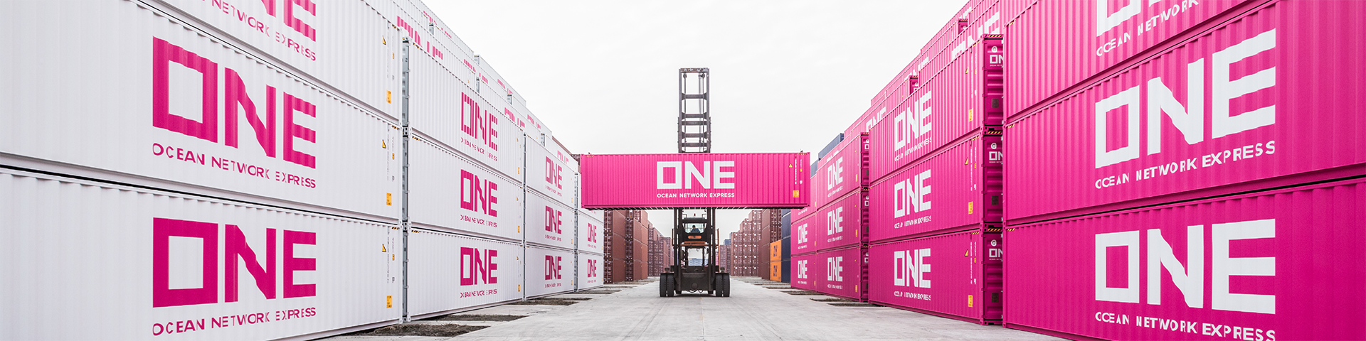
In an industry dominated by functionalism and tradition, magenta became ONE’s statement of disruption.
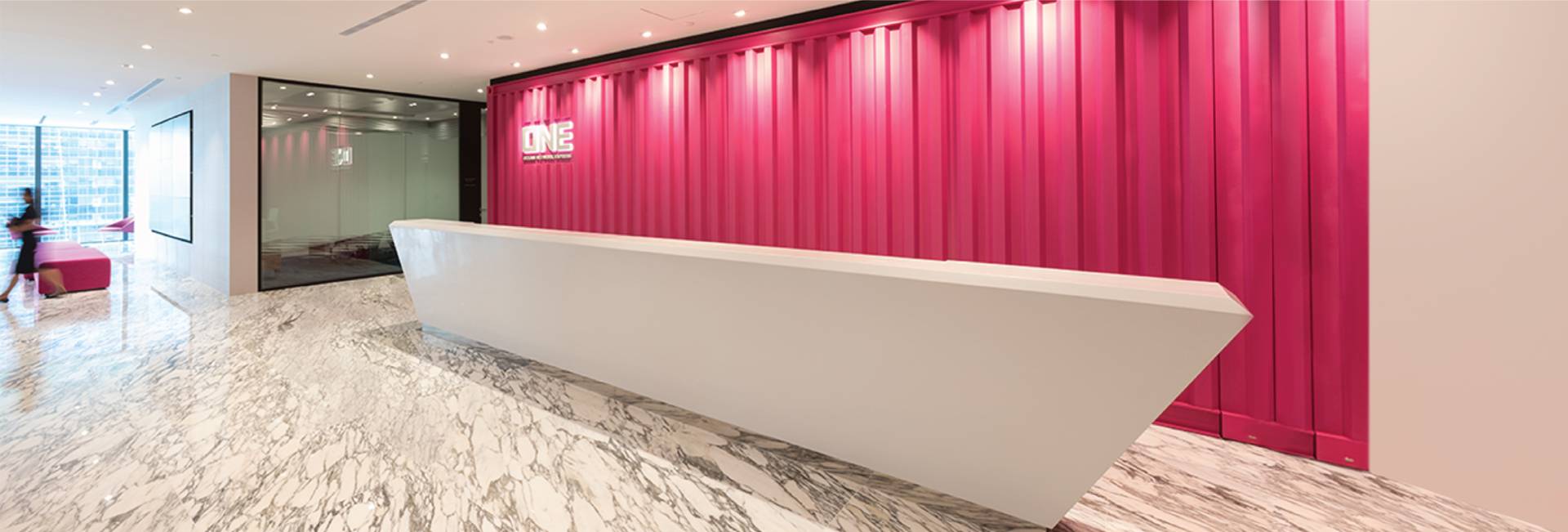
Visual Identity & Consistency
Beyond container color, ONE established a clean and modern visual identity:
- Logo: All-caps sans-serif typography for clarity and authority
- Tagline: “AS ONE, WE CAN” – emphasizing unity and purpose
- Brand guidelines: Applied consistently across the website, marketing materials, staff uniforms, office signage, and documentation
This level of visual consistency helped ONE build a cohesive brand image across all touchpoints—from digital to physical.
What ONE Gained: Real Business Impact Through Branding
Just three years after launch, ONE’s brand-first approach delivered impressive results:
- Became one of the top 10 global container shipping companies
- Rapid growth in fleet size and market share
- High brand visibility on social media, with thousands of user-generated posts featuring magenta containers
- Recognition in global branding and design awards
What started as a visual strategy has translated into measurable business success.
Key Takeaway: Even “Boring” Industries Can Brand Boldly
The logistics industry isn’t known for emotion, aesthetics, or design—but ONE has proven that: Even B2B companies in traditional sectors can build memorable brands if they dare to be different.
ONE’s branding isn’t just about color. It’s about owning a position in the market: young, unified, bold, and globally minded. While others compete on speed and price, ONE competes on identity and perception—and that’s where it wins.
Conclusion
ONE chose not to blend in, but to stand out—and that decision paid off. The company created a brand that turned shipping containers into viral visual icons, and built a reputation that goes beyond tonnage or transit times.
So, if you’re in a “dull” or difficult-to-brand industry, remember: A bold brand identity—even starting with something as simple as color—can create waves in even the most crowded markets.